From Funding Close to Community Confidence: A Practical Branding Roadmap for Housing Developments
When funding closes, the project stops being hypothetical.
The schedule tightens, stakeholders multiply, and what lived in decks and renderings starts showing up in the public realm — on fences, at the curb, in front of officials who have real opinions about what belongs in their city.
Real estate development branding is the system that helps a project move from concept to credible public presence. For affordable housing, multifamily, senior housing, student housing, and mixed-use developments, it connects naming, identity, signage, wayfinding, and resident experience into one clear story.
This is when branding stops being about taste and starts being about risk reduction. On public-facing housing projects — affordable, senior, student, multifamily, mixed-use — the brand becomes a tool for approvals, adoption, and long-term asset value.
It signals quality before anyone tours a unit. It reduces friction when neighbors and officials ask, “What is this, and why should we trust it?” And it turns a building into a place — with an experience that feels cohesive from arrival to hallway to home.
A strong development brand does three jobs at once
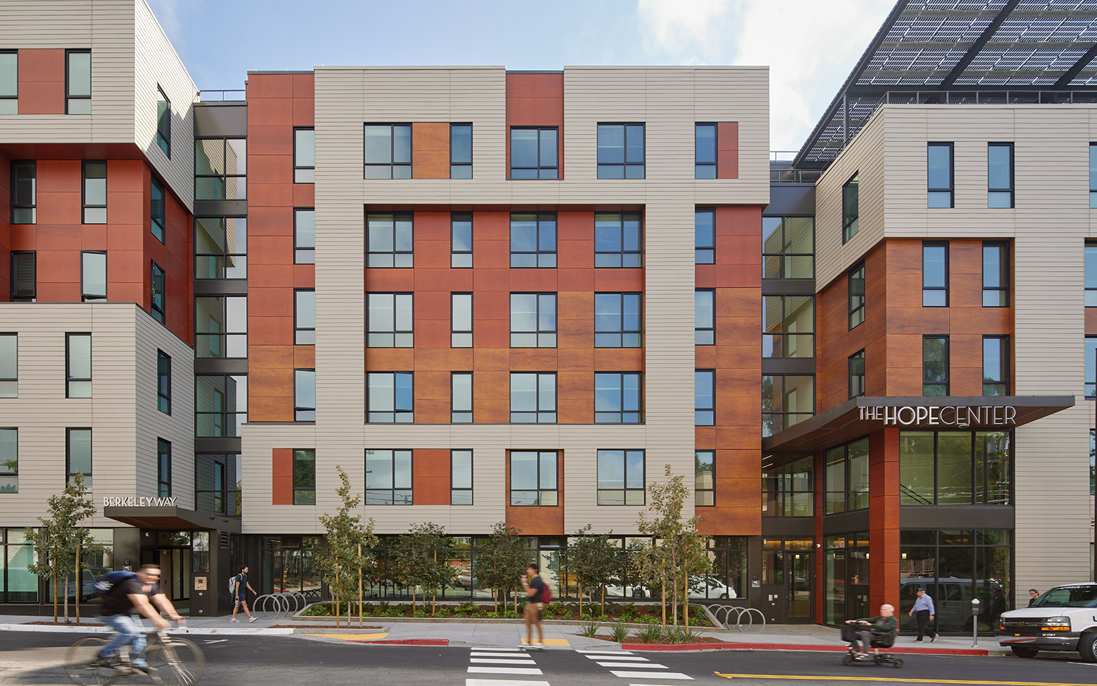
First, it signals quality immediately. Quality isn’t only materials and architecture — it’s also the visual system that frames the project: naming, identity, typography, color, and the way those decisions translate into signage and collateral. Even small refinements change how intentional and durable a project feels at first glance.
Second, it reduces friction for stakeholders. Brand consistency across presentations, site signage, and public-facing materials makes it easier for everyone to understand what’s being built and why it matters. Instead of each partner improvising visuals, the project speaks with one clear voice.
Third, it turns the building into a place. Wayfinding systems, signage hierarchy, and integrated art create belonging — not as a buzzword, but as a lived experience that helps residents and visitors feel oriented and welcome.
The roadmap: story > system > environment > experience
Step 1: Define the story
Before you debate logo options or choose sign finishes, you need a shared foundation — what the project stands for and who it serves. This alignment makes later approvals and stakeholder conversations smoother, because every decision ties back to civic context and community trust rather than personal preference.
A simple pressure test: can the project be described in one clear sentence that makes sense to both a neighbor and a city reviewer? If the team can’t repeat it consistently, brand execution will feel fragmented — because the project itself hasn’t been aligned.
Step 2: Build the identity system
Post–funding close doesn’t mean skipping identity work. It means building it in a way that’s ready for the real world. Proportions, negative space, and color all matter more than people expect — not just aesthetically, but practically.
A mark that works at distance performs differently than one designed for a screen. A palette tied to the surrounding environment still needs to hold up across interior materials, exterior signage, and printed collateral. These aren’t finishing touches — they’re implementation decisions that determine whether the brand holds together or falls apart in execution.
Step 3: Extend the brand into the environment
This is where brand becomes placemaking — and where stakeholder reality shows up fast. City feedback, street visibility, fire requirements, maintenance concerns, and fabrication constraints all enter the picture.
Exterior signage needs to work with the architecture and the approvals process, not just look good in a rendering. Interior wayfinding shapes resident confidence every single day — clear navigation matters especially in housing where the population may benefit from strong, repeatable cues. A front-of-house versus back-of-house hierarchy keeps quality where residents experience it most while controlling cost where it matters least.
Materials are brand decisions too. The difference between weathered steel and powder-coated metal, between a concrete base and a fabricated panel, between halo lighting and surface-mounted fixtures — these choices determine whether the project feels durable and intentional or like it was value-engineered at the last minute.
Step 4: Design for lived experience
The final layer is the one residents actually live in. Color by floor so people know where they are. Signage that’s legible at a glance, especially for unit numbers. Details that reinforce cohesion — so the identity that starts at the curb continues through the lobby and down the hall.
This is the difference between a building that feels like a product and one that feels like a place.
What done right looks like
At the end of this process, you should have a clear project story stakeholders can repeat, an identity system refined for real-world use, exterior signage that works within visibility and approvals constraints, and interior wayfinding that supports the resident experience without blowing the budget.
The outcome is straightforward: a building you’re proud to point to — one that strengthens your portfolio and makes the next development easier because stakeholders already trust what you deliver.
FAQ
What is real estate development branding?
Real estate development branding is the strategy, naming, identity, signage, and environmental experience that help a project feel clear, credible, and connected to place.
When should branding happen in a housing development?
Branding should begin before public-facing execution, ideally before signage, leasing materials, stakeholder presentations, and resident communications are finalized.
How does wayfinding support multifamily or affordable housing?
Wayfinding helps residents, visitors, staff, and emergency responders move through a property with confidence, clarity, and consistency.
Post–funding close and heading into execution? Share your project type, timeline, and approval context. We’ll help map a branding, signage, and wayfinding scope that supports stakeholder trust, resident experience, and a cohesive sense of place — without adding friction to your schedule.

Join Us!
Join our mailing list to receive strategies, practical advice, news and helpful resources delivered right to your inbox.